
Hundred Proof
A responsive web application to scale cocktail recipes or dilute spirits
-
View Project
-
Client
-
My Role
Visual design, UI design, UI copy
Challenge
Zach, a front end developer and UX designer, approached me to help with Hundred Proof, the responsive home bartending web application he'd created to do the math necessary to dilute homemade liqueur.
The UX had already been worked out, and I was tasked with the visual design and UI.
I wanted Hundred Proof to feel lighthearted, approachable, and contemporary, but with nods to the material culture of food, drink, and entertaining from the 19th and 20th centuries.
Solution
Visual Design
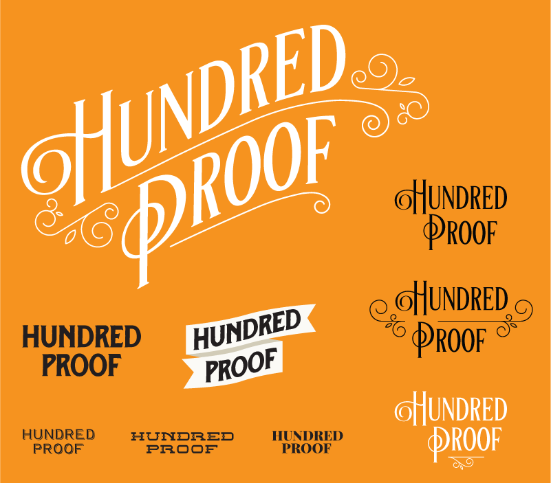
Wordmark and Illustrations
I'm not much of a drinker, but I love looking at liquor bottles. I'm fascinated by labels that read "vintage", but upon closer inspection are actually designs created to appeal to a contemporary audience that rely on a gestalt of color, type, and sometimes texture, to evoke the heritage of the product.
I didn't want Hundred Proof to feel vintage, but I did want my design to include visual references to vintage ephemera, like labels, recipe books, and hostess guides, as a nod to the tradition of sharing drinks with friends.
The wordmark uses an ornate serif font surrounded by simple line ornaments to evoke an old-fashioned label while still feeling clean and contemporary. I'd put together some ideas that featured more historically accurate type featured on some labels, and it felt too "old-timey".
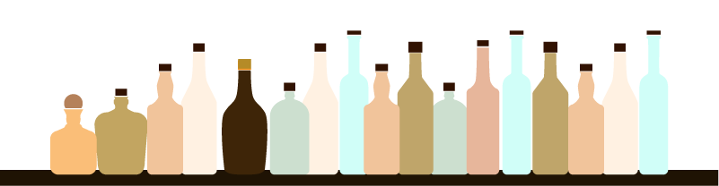
The bottles that frame the header and the footer are a flat homage to illustrations from mid-century recipe books.
Color Palette
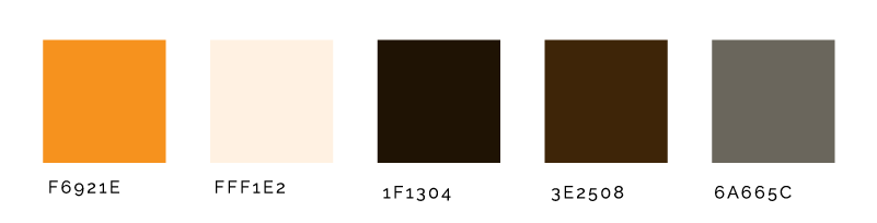
I wanted Hundred Proof to feel inviting, so I chose a minimal color palette in warm tones. Gold dominates the header behind the wordmark, and is also used in hover and focus states in the UI. Tints of brown are used in place of black for a softer feel. Pops of pale blue in the bottle illustrations contrast with the gold to keep everything lively.
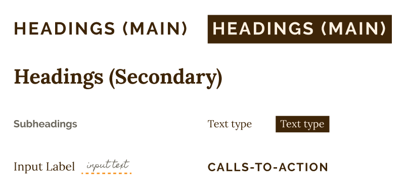
Typography
The typography pairs two contrasting Google Fonts, Raleway and Lora, for display type and text type respectively. Homemade Apple, a handwriting font in a gray tone mean to evoke graphite, is used for the text in input fields to recall the handwritten tags on small batch spirits, and of course, recipe cards.
Icons
The custom icons featured in the dilute tool are graphically reduced to read well at a small size. The first set I created had more detail and variation in line weight. The overall effect wasn't as clean as I wanted, so I simplified them further, and used a finer line with less contrast in width to create the final set.
User Interface
Design and Layout
The UI design and layout was a true collaborative effort between Zach and me. Zach had worked out how he wanted to handle some of the inputs, and I contributed to the layout.
The Hundred Proof application is a simple one-column layout that expands to two columns on a wider screen. This pattern is present throughout. On screens where a calculation is being done, the inputs are on the left, and the results appear on the right.
UI Copy
In addition to helping with the layout and design, wrote the UI copy for Hundred Proof. I view UI copy as an opportunity to establish the mood and tone of an application in addition to being instructive. I wanted the copy for Hundred Proof to feel helpful, conversational, and fun for users.
Homepage
When Hundred Proof was first designed, it was only a dilution app. When the Scale tool was added, we added the homepage as well.
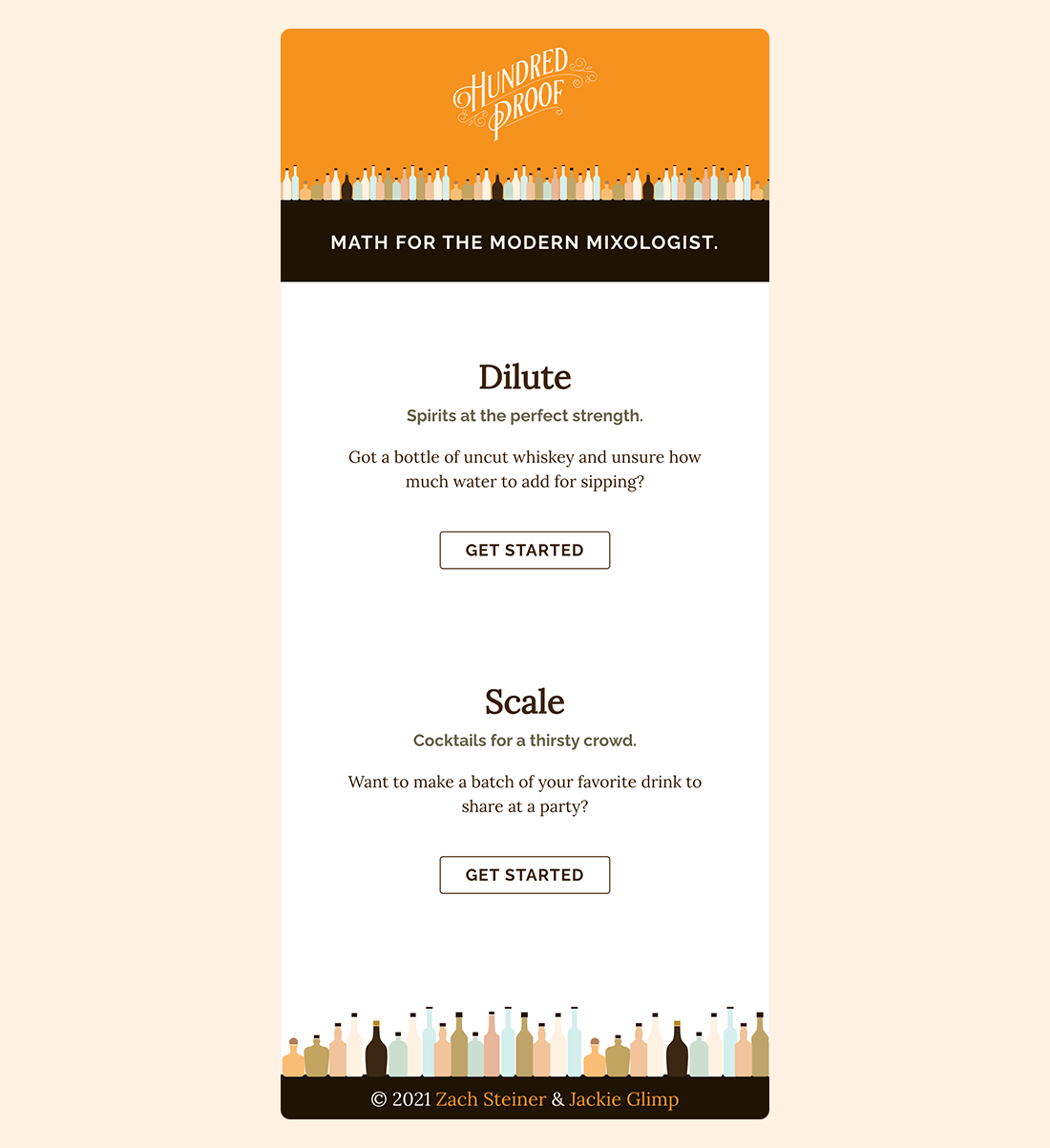
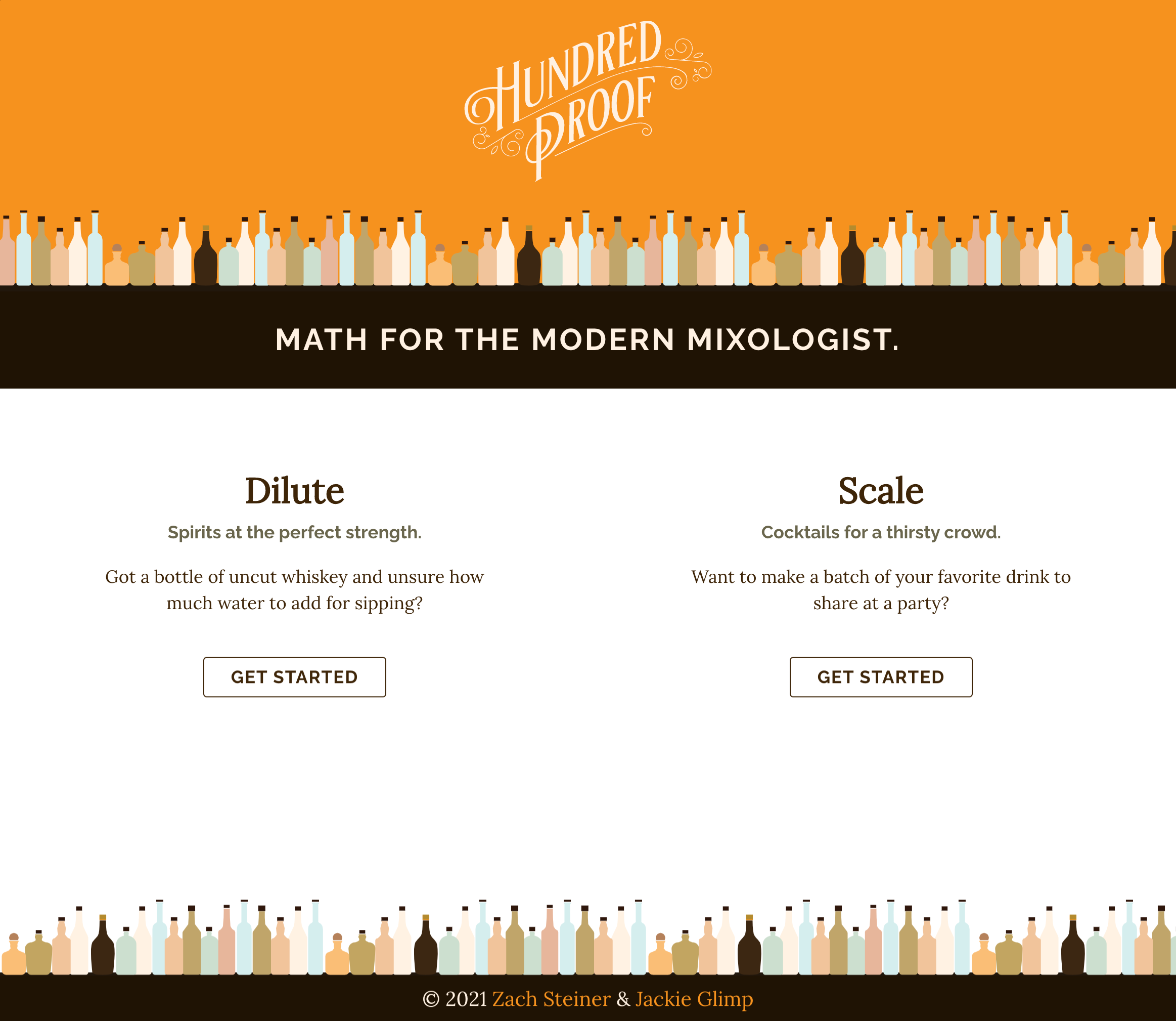
Below the header and tagline are two sections, one for the Dilute tool, and one for the Scale tool. The description helps the user determine which they want to use, and a call to action under each takes the user to the tool of their choice.
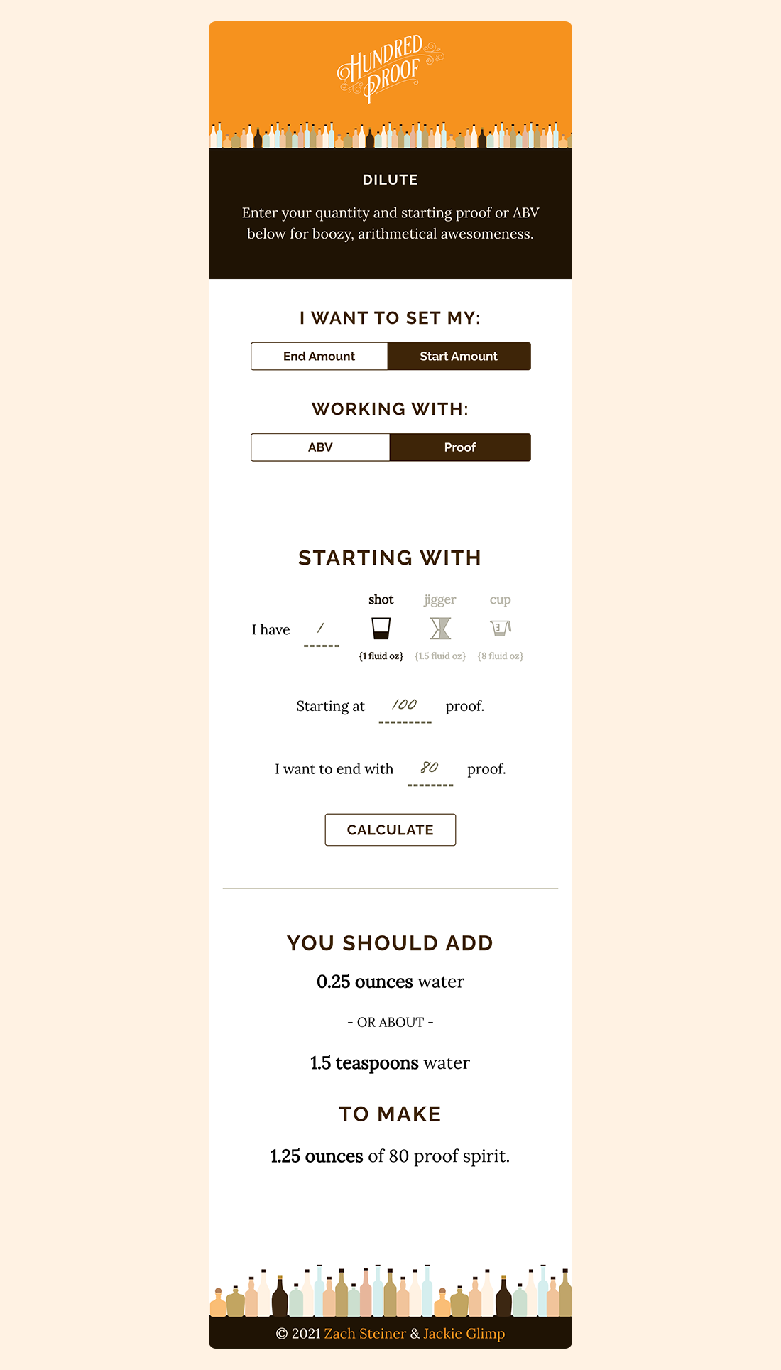
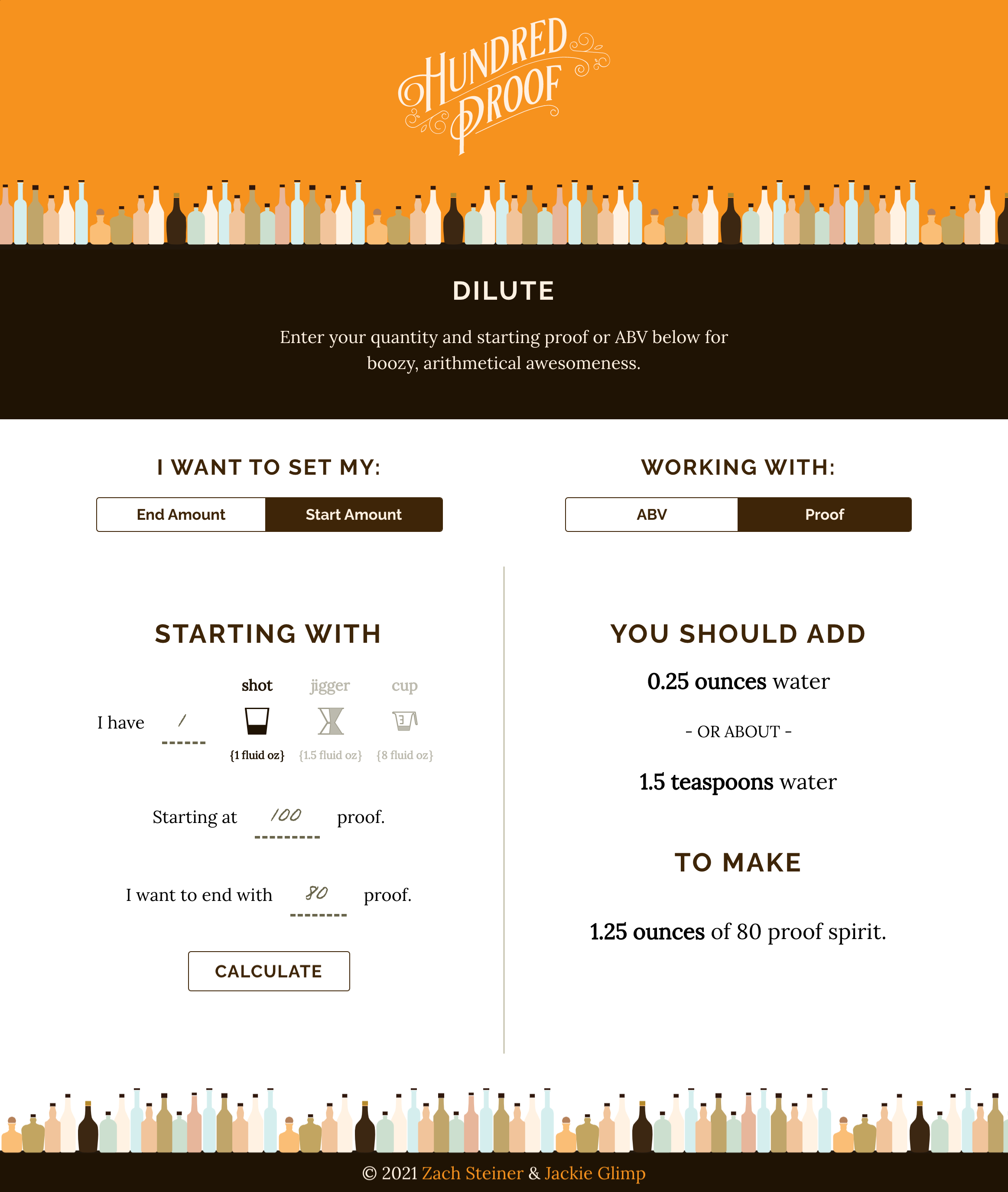
Dilute Tool
The Dilute tool is the original purpose of Hundred Proof, and the first calculator that Zach developed to help take the guesswork out of dilution math.
Using segmented buttons at the top of the interface, the user specifies if they're trying to arrive at a specific quantity of diluted liqueur (End Amount), or if they have a starting amount (a shot for example) that they want to dilute to a specific strength (Start Amount).
Strength is indicated using different measures, so another segmented button allows the user to choose ABV or Proof to eliminate the need to convert one to the other to reduce cognitive load.
When entering an amount, the user is able to choose between common bartending measures, like a shot or jigger, which are labeled below with the corresponding volume in fluid ounces.
The user enters a starting proof or ABV, and the strength they want, and is shown the amount of water to add in both teaspoons and fluid ounces to arrive at the desired strength.
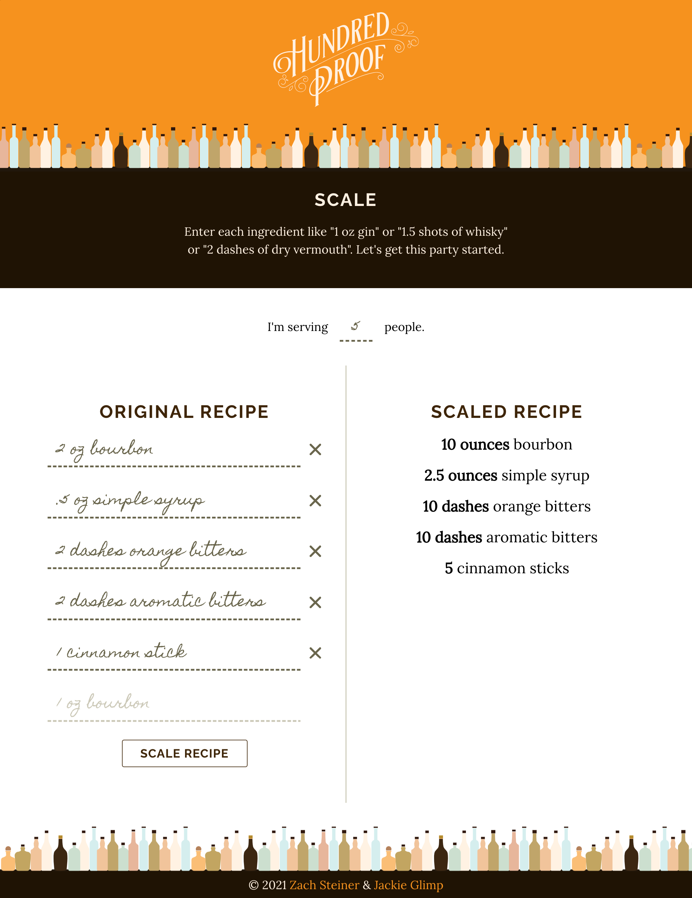
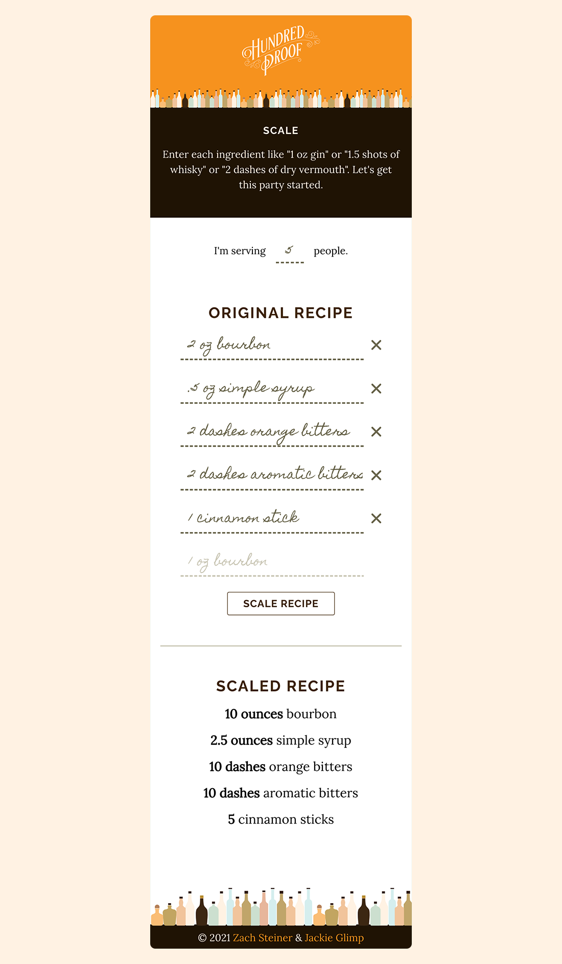
Scale Tool
The scale tool allows the user to convert a recipe for a single cocktail into a batch. The user enters the number of cocktails they'd like to make, then enters the recipe to scale.
Lessons Learned
Favor Speed and Iteration over Perfection
Since I've started designing for software, I've attempted to adopt speed as an operating principle.
The possibility of iteration, and the knowledge as a UI and UX designer that Version 1 of a feature is likely NOT going to be Version Forever is a great reason to lean into delivering quickly and being less hung up on achieving perfection, which has been an issue for me in the past. I know that I can execute pixel-perfect designs (and I do), but in some instances, I find myself questioning the usefulness of perseverating over details that are probably undetectable to a majority of users.
This project has been an extremely useful exercise in moving quickly, and iterating as I go.
Designers and Developers are Better Together
I love working with developers. I count collaborating closely with front end developers to help excute a UI among some of my favorite work experiences to date.
I find it so much more valuable to have a conversation about implementing more difficult parts of a design, rather than getting caught in the back and forth of failing something in QA because the UI isn't right. There were a number of small changes, or compromises, to the UI of Hundred Proof, mostly because the font chosen for the input text was difficult to work with. I'm really glad to have had the opportunity to collaborate in real time to work through these, and I'm really happy with where we landed.
- Layout
- UI Design
- Responsive Application
- Icons
- Visual Design
- Typography
- Ui Copy
- Color Scheme
- Wordmark