Di Frutta
Web Layout
Challenge
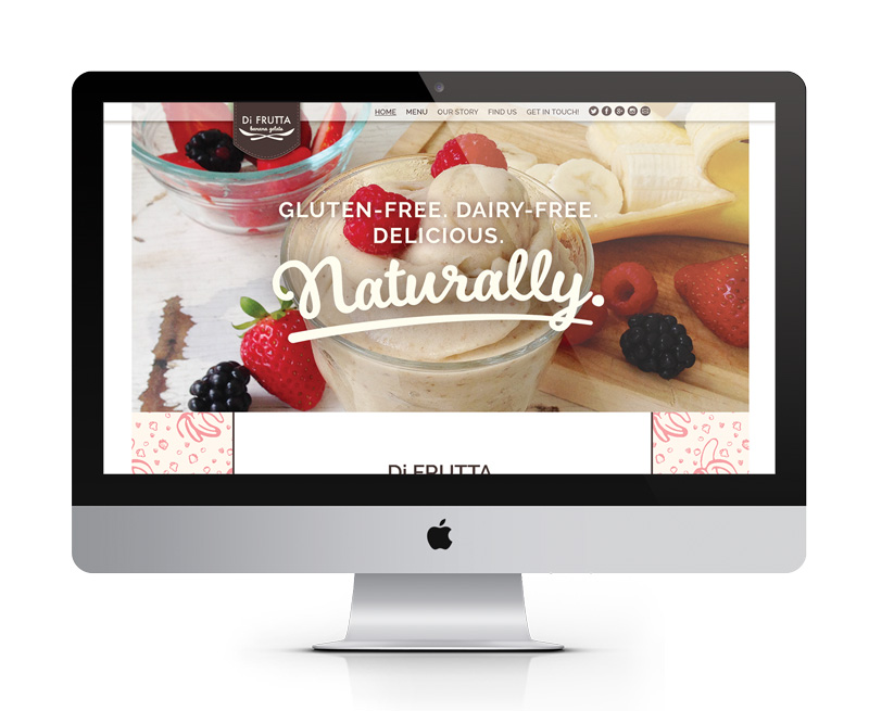
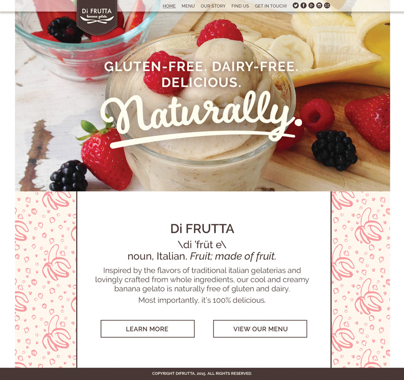
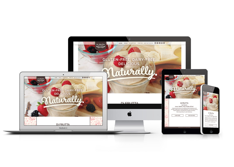
To design a website homepage to sell Di Frutta frozen banana dessert
Audience
Health-conscious individuals, primarily women, college to middle-age
Solution
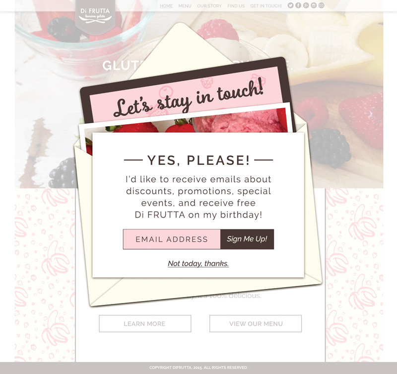
This site presents Di Frutta as a healthy yet fun alternative to frozen yogurt or ice cream. The mostly neutral color palette hints at the product's wholesome, natural ingredients, while the pops of pink evoke the sweetness of fruit. Hand-illustrated fruit makes up the background pattern, and lends a feeling of fun and spontaneity.
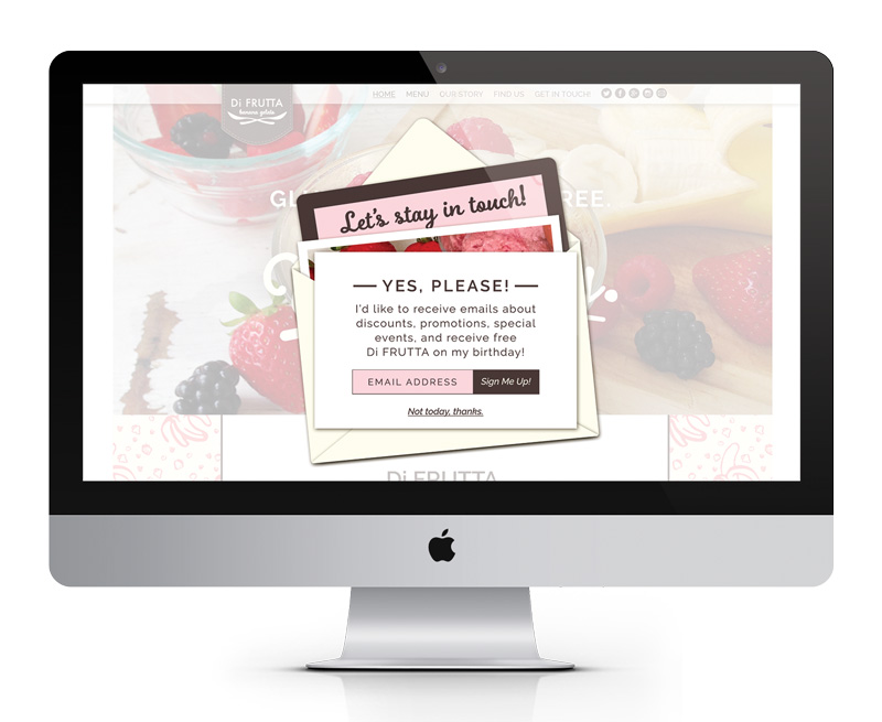
The call to action modal, an invitation to engage with the brand via emails, is visually reminiscent of an opened invitation.
Role
Designer, illustrator, photographer, copywriter
Back